Why the submit button might be the highest-leverage element on your landing page.
Welcome to Day 10 of the 30 Days of Growth.
This is a pop-up newsletter put together by the team at Growth In Reverse. We’ve pulled 30 creators together to help give one short, actionable way you can either grow or improve your email list.
You can view past issues here.
What if you could change one thing on your newsletter landing page, and get 5x more subscribers?
That’s exactly what happened to Max.
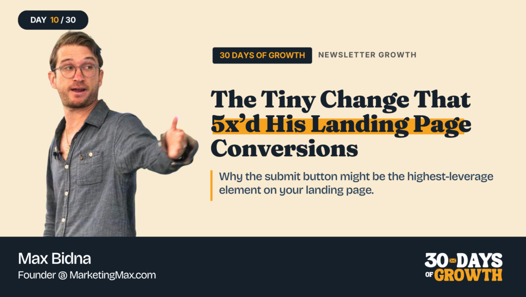
Max Bidna runs Marketing Max, a newsletter for marketing operators.
He’s been A/B testing his landing page for years (and tracking every variant in obsessive detail).
His original landing page converted at 7.56%. And while that’s not the worst conversion rate I’ve seen, there’s definitely some room for improvement.
Max thought so too.
So he made one simple tweak to his landing page – and saw that change jump his conversion rate to 37.8% – a 5x increase. On the same page with the same offer.
Here’s what he did.
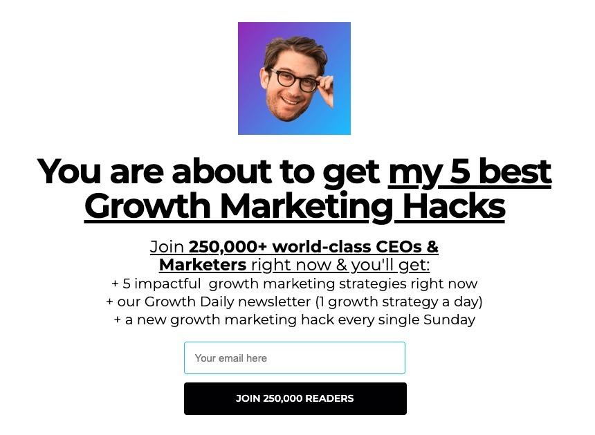
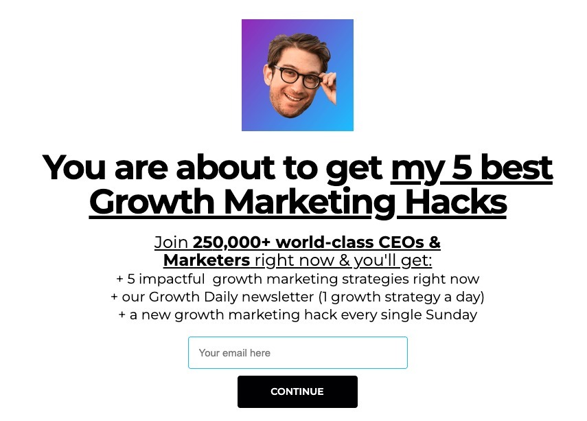
Max took the ‘submit’ button and shrunk it, centered it inside the form, and changed the button word to “Continue.”
And it was that last button text change that took conversion to 37.8%. A 5x jump on the same page, the same traffic, and the same offer.
How Max Did It
1. He treated the ‘submit’ button as a high-leverage element. A lot of testing energy goes to headlines and lead magnets, but Max found the button moves the needle more than either of those.
2. He tested 20+ variants on the button copy alone. He’s tried “submit,” “start now,” “send me the lead magnet,” and “continue” with an emoji arrow. The plain word “Continue” beat all of them.
3. He shrunk and centered the button. The original was wide and full-width (see previous image). Making it smaller and centered inside the text box outperformed the bigger version (see image below).
4. He runs one variant at a time. Every change is its own test, so he knows exactly which element moved the needle. That’s how he can attribute the 5x jump to the button itself.
5. He’s been testing this for 3+ years. Over 200 variants later, the same form converts at 56.7%, up from the 7.56% he started with. Compounding small wins is the whole game.
Why It Works
Visitors are skeptical of any opt-in form. The submit button is the last thing they read before deciding whether to give you their email. The word “Continue” feels like a step in a flow they’re already in, while “Submit” feels like work.
Smaller buttons can also outperform bigger ones because they sit naturally inside the form. The visitor’s brain reads them as a quiet UI hint that keeps the flow going.
The volume of testing is what compounds. Any one test might give a 1.2x or a 1.05x lift; run 200 of those on your most important page over 3 years and Max ended up with a 7.5x lift overall.
Results
- Landing page conversion jumped from 7.56% to 37.8% from one button test – a 5x lift on the same page, same traffic, same offer
- After 200+ variant tests over 3 years, the same form now converts at 56.7%, a 7.5x lift from where he started 🤯
- On the paid side, that conversion lift dropped his cost per subscriber on Meta ads by 80%, which means Max gets 5x the subscribers from the same ad budget
- Higher conversion compounds across every traffic source you already have. Referral pages, social posts, podcast plugs, and SEO traffic all funnel into the same form, which has downstream effects on every single one
How You Can Implement It
Step 1: Audit your current landing page form. Note the button copy, the button size, and where it sits in the form. Take a screenshot of it before you make any changes.
Step 2: Make the button copy your first test. It’s the cheapest change to ship, and Max’s data says it moves the needle more than the headline or any other element.
Step 3: Draft 4-5 button variants. “Continue” won for Max, so include that one, plus a couple takes like “Get my [thing]” or “Send it.”
Step 4: Run one test at a time for a long enough period where you can gather data. (Resist the urge to change 3 things at once, you won’t know what worked.)
Step 5: Track the conversion rate for each test.
Step 6: Keep going. Once button copy is locked, move to button size, then headline, etc. The compounding only happens if you keep running tests.
Tools
- A landing page tool (bonus if it supports variants)
- A simple spreadsheet to log every test
Changing up the button text worked like really well for Max. It’s a small change that’s easy enough to test, so it’s worth experimenting with. Especially if conversion rates improve. Just make sure you test it properly so you truly know if it’s working.
See you tomorrow,
Chenell
P.S. P.S. You can follow Max on LinkedIn , or subscribe to Marketing Max at marketingmax.co.