
Everyone talks about the big strategies – paid ads, viral tweets, complex funnels.
But some of the most effective growth levers are actually tiny changes you can make in less than an hour.
We recorded an episode recently sharing 14 of these tips:
Let’s break down some simple tweaks that can seriously boost your subscriber growth and engagement.
1. Simplify Your Landing Page
I’m not talking about your entire website here, let’s hone in on your landing page.
The quick win: delete your navigation menu.
When you have too many elements on a page, it can really hurt your conversion rate. People get distracted 🐿️ and start clicking elsewhere.
But this page was built solely to get people to subscribe.
I stole this idea from Dru Riley at Trends.vc and it works surprisingly well. His landing page is just:
- Email box
- Subscribe button
- Basic context about the newsletter

That’s it.
No fancy menus, no distractions, just one thing for people to do. His conversion rate? 40-50%.
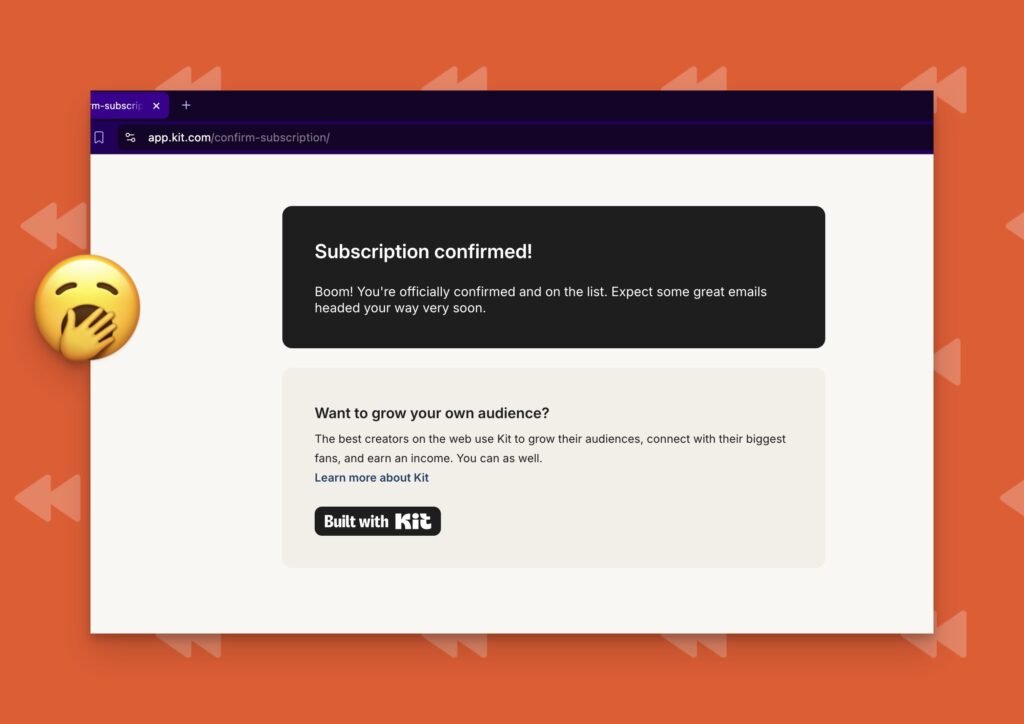
2. The “Almost There” Page Almost No One Uses
Most people’s confirmation pages are boring: “Thanks for subscribing!” crickets
Instead, try an “Almost There” page that actually drives action. The folks at Growth.Design do this brilliantly – they have this cute animated character pointing people to their Gmail inbox.
Here’s why I think this works so well:
- Clear instructions for finding the confirmation email
- Direct link to Gmail that filters for their emails
- Visual cues pointing to the next step
This helps ensure new subscribers actually see your first email.
Pro tip: Include what they call a “sniper link” – a direct link to Gmail that filters for only your emails. It makes it super easy for new subscribers to find your welcome email.
Here is an example of a Sniper Link that sends you directly to Gmail with a special “Email from Chenell!” filter applied.
3. Make Your Thank You Page Work Harder
Another page creators forget about? The thank you page.
It’s an easy opportunity to speak to someone who is at their highest point of excitement towards your content. They just decided you were worthy of theri email. And yet, so many people just have the default page setup.
You can turn this confirmation page into an opportunity to connect deeper with your new subscriber.
Here is what mine looks like:
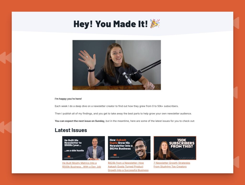
This transforms a typically dead-end page into a meaningful touchpoint.
Pro-tip: Sometimes you have a page setup but you create a new form and don’t link it to that page. Happens all the time. So don’t think you’re immune if you’ve already created this. Double-check every month or so!
4. The Welcome Email That Made Me Jealous
You know those emails that make you go “damn, I wish I’d thought of that”?
CJ from Mostly Metrics sent me one that actually made me a bit jealous.
He themed the entire thing around Breaking Bad (for his paid tier). Subject line? “Thank you for Breaking Bad and going paid.” And the first headline? “Let’s cook” with a picture of the show’s characters.
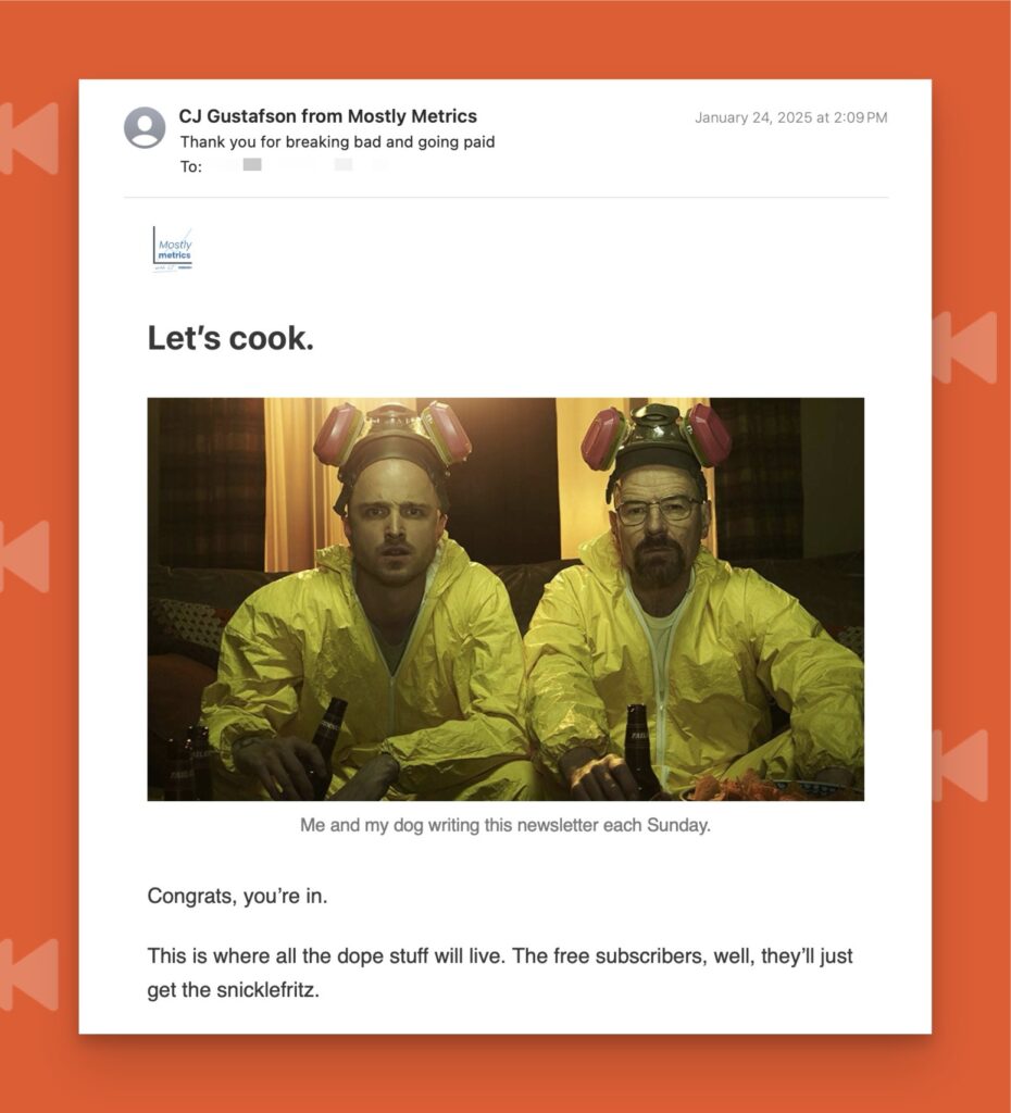
The best part? He’s known for loving Miller Lite, so he ends with a GIF of a Miller Lite can sliding across a table with “Cheers, it’s metrics time!”
It’s perfect because it:
- Shows personality
- Matches his brand
- Makes people smile
- Proves he actually put thought into it
It helps you stand out, and in a sea of boring emails, we could all use a little bit of personality.
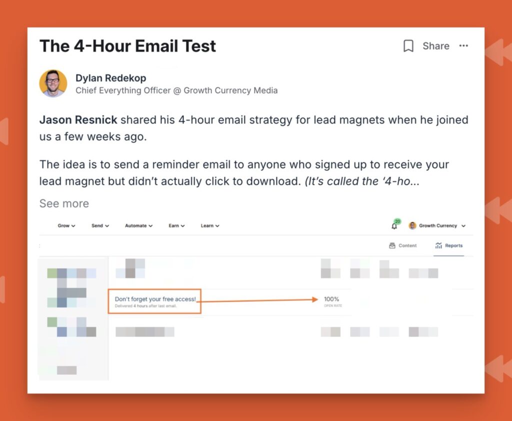
5. The 4-Hour Email That Gets 90% Clicks
Here’s a sneaky trick from Jason Resnick: If someone signs up for your lead magnet but doesn’t download it, send them a reminder email 4 hours later.
Sounds simple, right? But check this out – about 90% of people who didn’t click the first time will click that reminder email. It’s like free engagement just waiting to be claimed.
Dylan recently shared his results with this in the Pro community:
6. More Quick Wins You Can Implement Today
- Ask for a reply: The Google gods love seeing actual inbox engagement. I ask people to reply with how they found my newsletter – helps my deliverability AND gives me valuable intel.
- Add your LinkedIn: I mention in my welcome email that people can connect with me there. Gets tons of connections from people saying “Just subscribed, wanted to connect!”
- Test multiple subject lines: I write 5-10 quick versions before picking one. Don’t need fancy A/B testing – just brainstorm different angles.
- Anniversary emails: Send a little surprise when someone’s been subscribed for 30 days. Josh Spector gives away a free course session – smart way to preview his paid offering.
7. My Favorite Research Hack…
Learn from other newsletters who are paying on certain channels.
Sign up for a newsletter and see the “Paid Recommendation” tag near an email list? Sign up for it.
You can almost guarantee they’re putting some extra effort into optimizing that workflow. They’ve often refined their onboarding process through testing and optimization.
If you want more ideas and small changes you can make, check out this episode we recorded for you.
Reality Check
You don’t need to implement all of these at once. Pick one or two that resonate with you and your style. The key is making small improvements that add up over time.
And remember – while none of these changes will 10x your growth overnight, they’ll help you build a more engaged audience that actually looks forward to seeing you in their inbox.
And are probably more likely to share. Which means you can be less reliant on the social media hamster wheel.
What small changes have made a big difference in your newsletter? Let me know in the comments below!